
Direct support platform for PMs
Direct support platform for PMs
Direct support platform for PMs
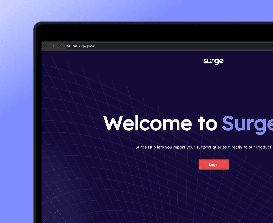
Surge Hub is an internal support and communication platform designed to centralise queries from cross-functional teams and route them efficiently to Product Managers.
Surge Hub is an internal support and communication platform designed to centralise queries from cross-functional teams and route them efficiently to Product Managers.
Industry
Industry
Internal Tools / SaaS
Internal Tools / SaaS
Tools
Tools
Figma, Adobe Illustrator
Figma, Adobe Illustrator
Figma, Adobe Illustrator
E-commerce
Team
Team
1 UI/UX Designer | 2 Developers | 1 Product Manager
Front-end Developers, Project Manager,
UI/UX Designers
1 UI/UX Designer | 2 Developers | 1 Product Manager
Timeline
Timeline
5-6 weeks
Front-end Developers, Project Manager,
UI/UX Designers
5-6 weeks
E-commerce
Link
E-commerce
About
About
About
Surge Hub is a tool that helps cross-functional teams send requests to product managers in one place. It removes the need for messy Slack threads and emails, making it easier to track, respond and manage incoming work.
Surge Hub is a tool that helps cross-functional teams send requests to product managers in one place. It removes the need for messy Slack threads and emails, making it easier to track, respond and manage incoming work.
My Role
My Role
My Role
My role in this project was UI/UX Designer
• I was solely responsible for the product design from start to finish
• Designed user flows, wireframes, and final UI screens
• Handed off designs to developers with all the necessary specs
• Collaborated with the team to structure the platform based on user and business needs
My role in this project was UI/UX Designer
• I was solely responsible for the product design from start to finish
• Designed user flows, wireframes, and final UI screens
• Handed off designs to developers with all the necessary specs
• Collaborated with the team to structure the platform based on user and business needs
How I Approached This Design?
How I Approached This Design?
How I Approached This Design?
1.Research
1.Research
This was the starting point for the project and I outlined:
• Target Users: Product Managers and internal teams
• Problems: Too many communication channels, leading to missed or overlooked requests
• Goals: Bring all requests into one place, improve tracking, and speed up response times for better collaboration
This was the starting point for the project and I outlined:
• Target Users: Product Managers and internal teams
• Problems: Too many communication channels, leading to missed or overlooked requests
• Goals: Bring all requests into one place, improve tracking, and speed up response times for better collaboration
2.Wireframes
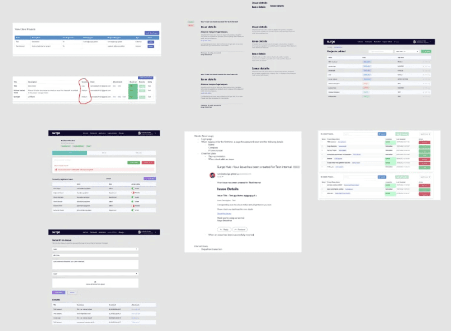
For the early wireframes, I focused on the key actions:
• Submitting a Request: Streamlined the process to make it simple and fast for teams to submit requests with clear details.
• Tracking Request Status: Made it easy for users to check the status of their requests in real-time.
• Managing Requests as a PM: Gave Product Managers the ability to view, prioritise, and manage multiple requests at once.
These wireframes were a good starting point for testing ideas and gathering feedback before moving into the final design phase.
For the early wireframes, I focused on the key actions:
• Submitting a Request: Streamlined the process to make it simple and fast for teams to submit requests with clear details.
• Tracking Request Status: Made it easy for users to check the status of their requests in real-time.
• Managing Requests as a PM: Gave Product Managers the ability to view, prioritise, and manage multiple requests at once.
These wireframes were a good starting point for testing ideas and gathering feedback before moving into the final design phase.
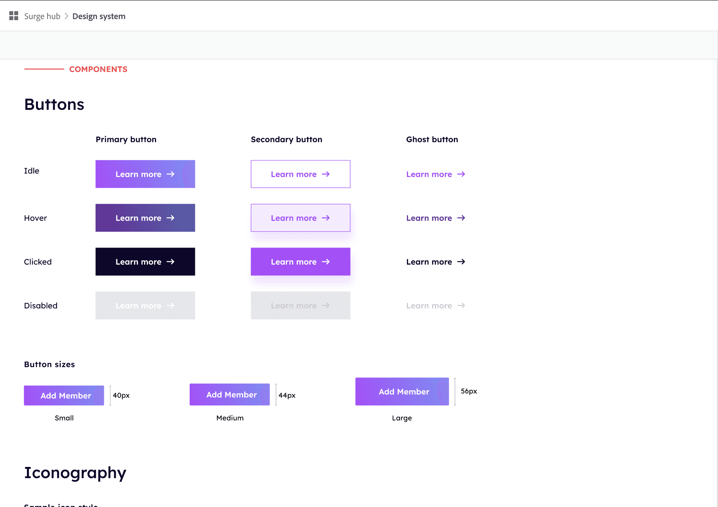
3.Design System & Style Guide
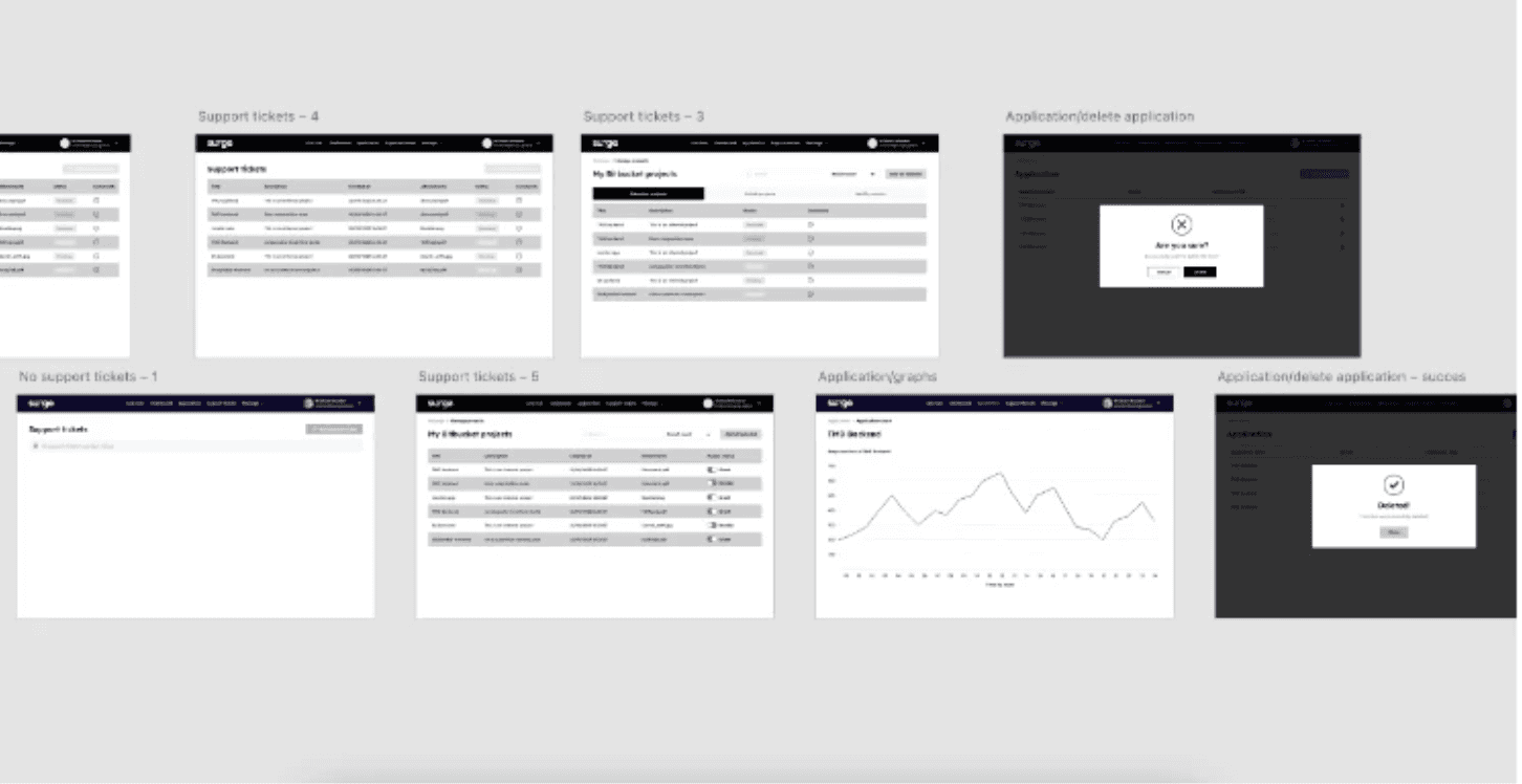
To keep things consistent, I put together a simple design system:
• Reusable Components: Buttons, inputs, and other UI elements to ensure consistency across all screens.
• Clear Typography & Colour Guidelines: Defined text styles and color rules for a cohesive look and feel.
• Scalable & Easy to Handoff: Designed with future updates in mind and to be easily handed off to developers.
To keep things consistent, I put together a simple design system:
• Reusable Components: Buttons, inputs, and other UI elements to ensure consistency across all screens.
• Clear Typography & Colour Guidelines: Defined text styles and color rules for a cohesive look and feel.
• Scalable & Easy to Handoff: Designed with future updates in mind and to be easily handed off to developers.
4.Prototype
4.Prototype
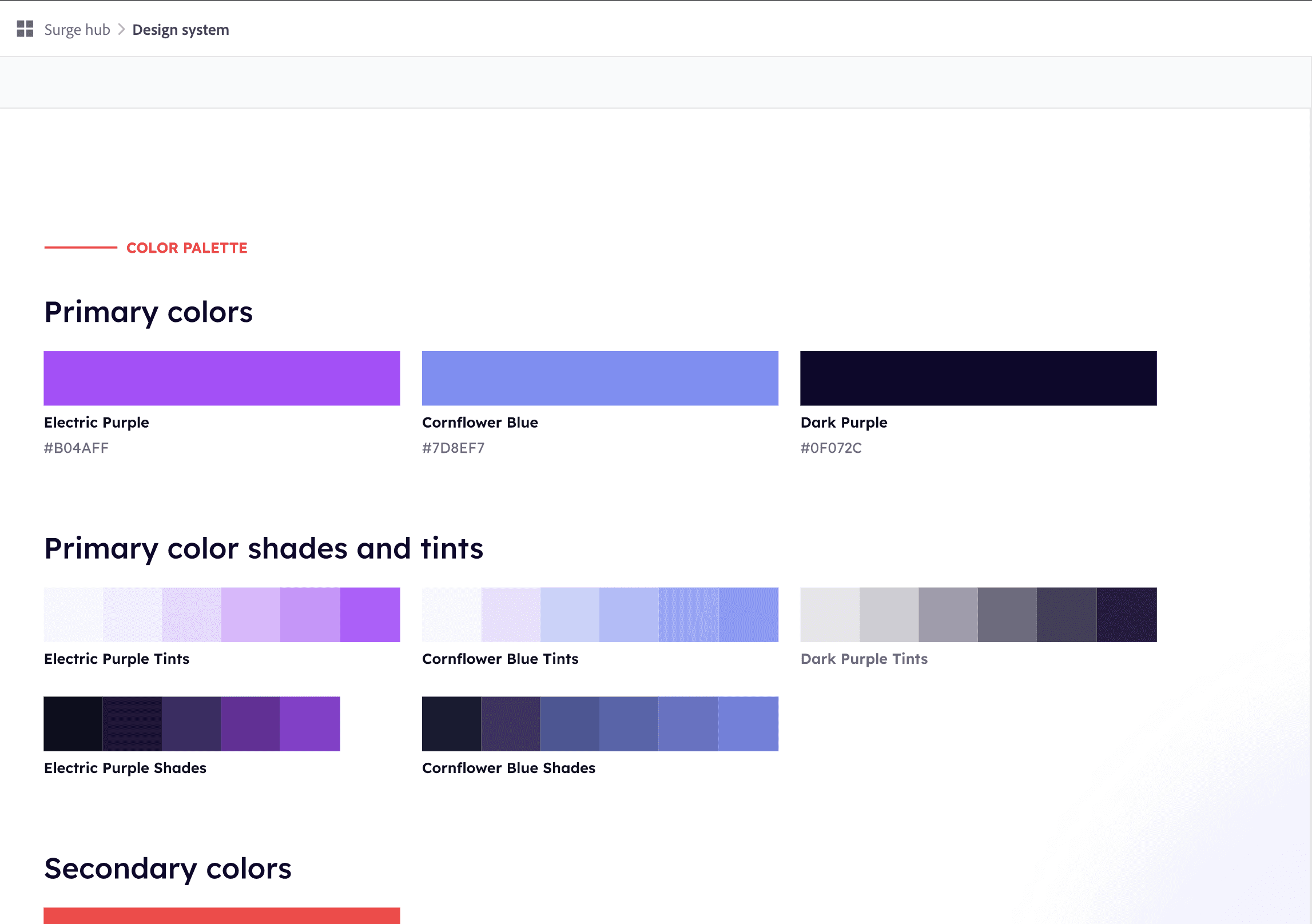
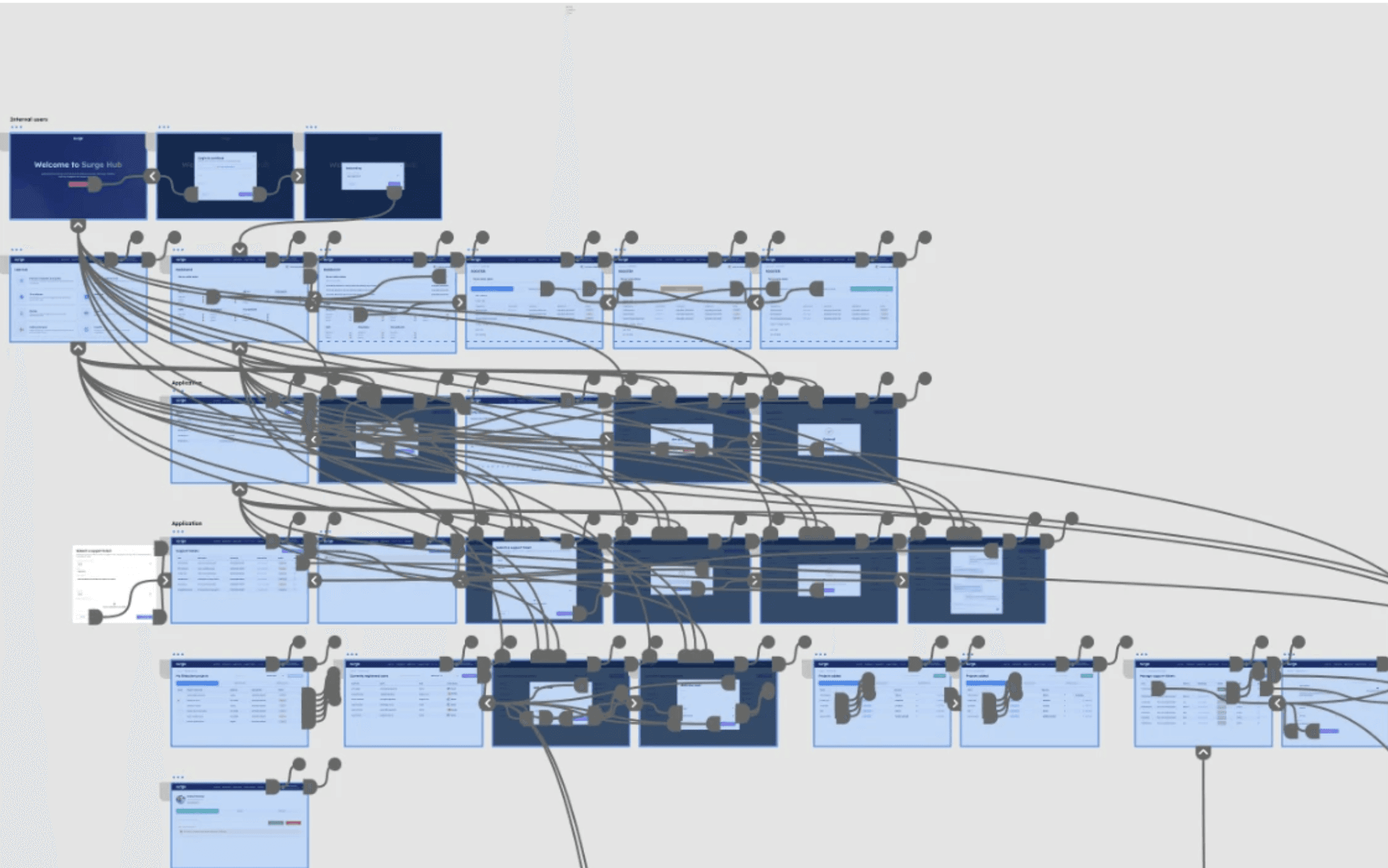
The clickable prototype shows:
• User Journey: How users navigate from one screen to another and interact with key features
• Screen Purpose: What each screen does and how it fits into the overall flow
• Complete Experience: How the app feels to use from start to finish, highlighting the smoothness of interactions
The clickable prototype shows:
• User Journey: How users navigate from one screen to another and interact with key features
• Screen Purpose: What each screen does and how it fits into the overall flow
• Complete Experience: How the app feels to use from start to finish, highlighting the smoothness of interactions
5.Testing and feedback
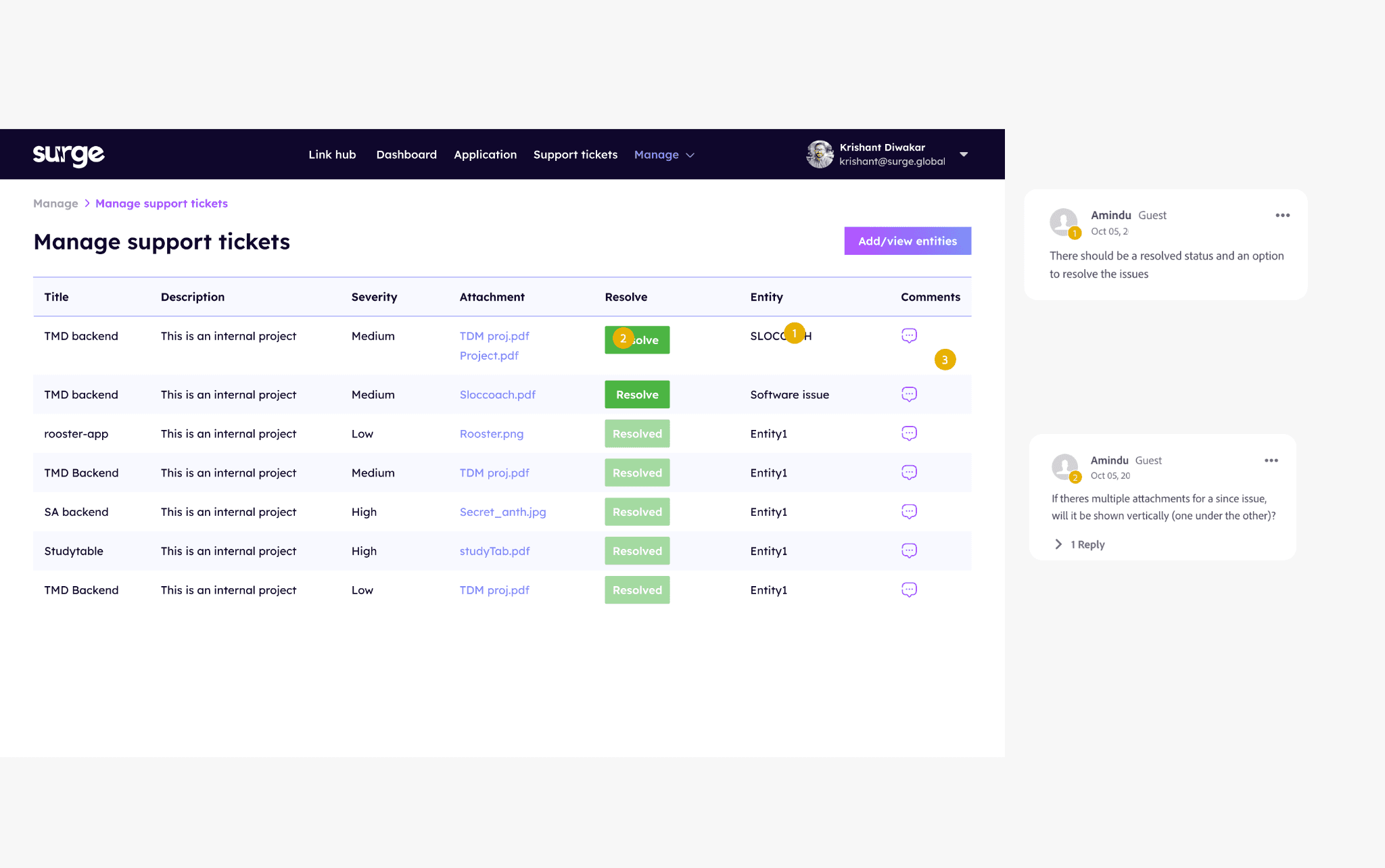
I gathered feedback primarily from Product Managers, who use the platform most often, as well as other team members to ensure all functionality was covered.
• Design Refinements: Small tweaks based on feedback, such as adjusting layout spacing and button placement for better clarity and flow.
• Functionality Testing: Ensured all features worked as expected by testing core interactions and workflows on the desktop platform.
6.Final Design
6.Final Design
The final design consists of several key screens, including a smart request form, a PM dashboard, and clear status indicators for requests. Below are screenshots of a few of the main UIs that highlight the key features.
The final design consists of several key screens, including a smart request form, a PM dashboard, and clear status indicators for requests. Below are screenshots of a few of the main UIs that highlight the key features.
Request Submission Screen
A clean, guided form that helps team members submit requests with the right details, reducing back-and-forth.
Request Submission Screen
A clean, guided form that helps team members submit requests with the right details, reducing back-and-forth.
Delete Confirmation Popup
A confirmation message to prevent accidental deletions and ensure users review actions before removing a request.
5.Testing and feedback
I gathered feedback primarily from Product Managers, who use the platform most often, as well as other team members to ensure all functionality was covered.
• Design Refinements: Small tweaks based on feedback, such as adjusting layout spacing and button placement for better clarity and flow.
• Functionality Testing: Ensured all features worked as expected by testing core interactions and workflows on the desktop platform.
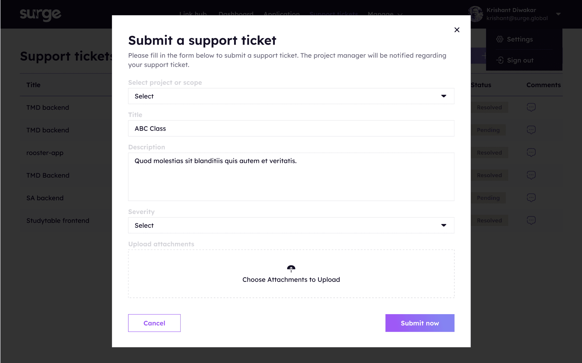
Support Ticket Popup
A streamlined form that allows users to quickly submit support tickets with all necessary information, reducing delays and ensuring clear communication.
Delete Confirmation Popup
A confirmation message to prevent accidental deletions and ensure users review actions before removing a request.
Support Ticket Popup
A streamlined form that allows users to quickly submit support tickets with all necessary information, reducing delays and ensuring clear communication.
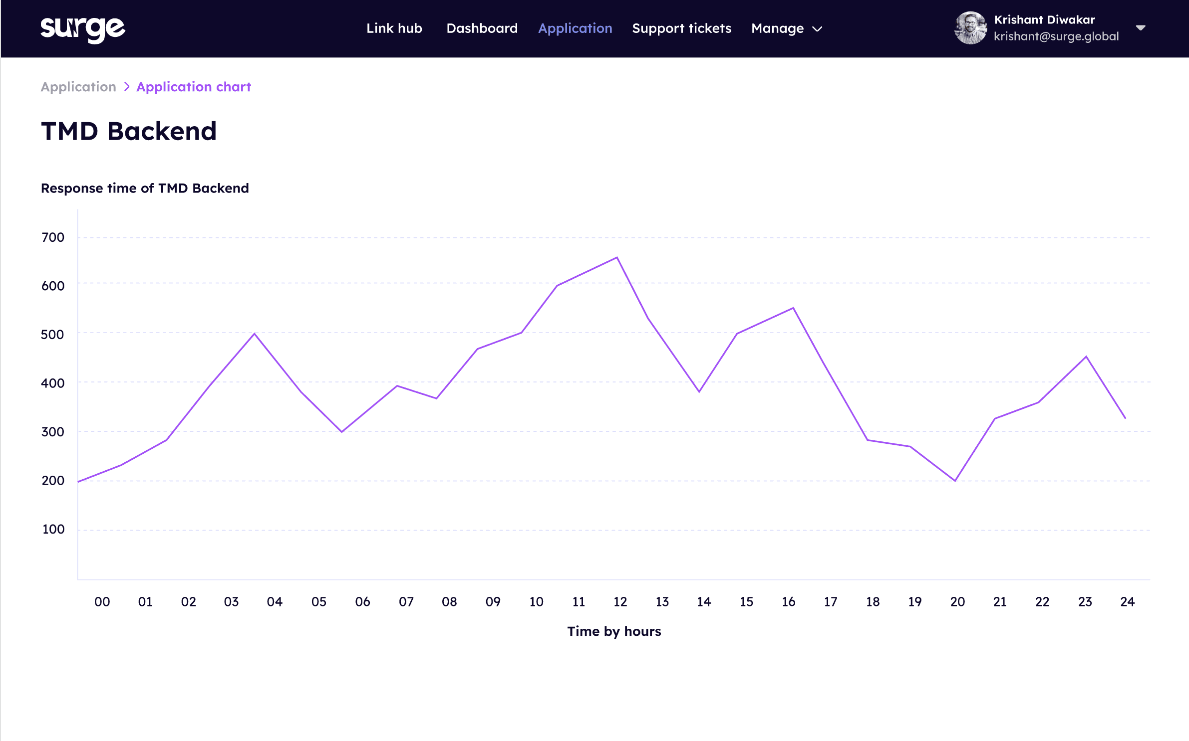
TDM Response Time Graph
A visual representation of average response times for requests, helping Product Managers track performance and identify areas for improvement.
TDM Response Time Graph
A visual representation of average response times for requests, helping Product Managers track performance and identify areas for improvement.
Reflection and Take Away
Reflection and Take Away
Reflection and Take Away
Working on Surge Hub taught me a lot about solving real internal team problems through design. The tool wasn’t about creating something flashy, it was about making everyday work easier for product managers and cross-functional teams.
Since the main issue was scattered communication, I focused on building clear flows and simple interfaces that let people send and track requests without confusion.
What I focused on:
• User flow clarity: Making sure it was easy to submit, track and manage a request
• Visual consistency: Using a simple design system to keep everything clean and easy to use
• Scalability: Keeping components flexible so the tool can grow with the team's needs
One thing I learned is how valuable early feedback is like showing wireframes and flows early helped catch small issues before they became bigger. I also saw how much smoother the dev handoff was because of a clean design system and detailed notes.
If I could go back, I’d spend more time testing with more team members before final designs but overall, this project helped me grow in designing tools that solve real workflow problems.
Working on Surge Hub taught me a lot about solving real internal team problems through design. The tool wasn’t about creating something flashy, it was about making everyday work easier for product managers and cross-functional teams.
Since the main issue was scattered communication, I focused on building clear flows and simple interfaces that let people send and track requests without confusion.
What I focused on:
• User flow clarity: Making sure it was easy to submit, track and manage a request
• Visual consistency: Using a simple design system to keep everything clean and easy to use
• Scalability: Keeping components flexible so the tool can grow with the team's needs
One thing I learned is how valuable early feedback is like showing wireframes and flows early helped catch small issues before they became bigger. I also saw how much smoother the dev handoff was because of a clean design system and detailed notes.
If I could go back, I’d spend more time testing with more team members before final designs but overall, this project helped me grow in designing tools that solve real workflow problems.