
Terractive Website Re-Design
Terractive Website Re-Design
Terractive Website Re-Design
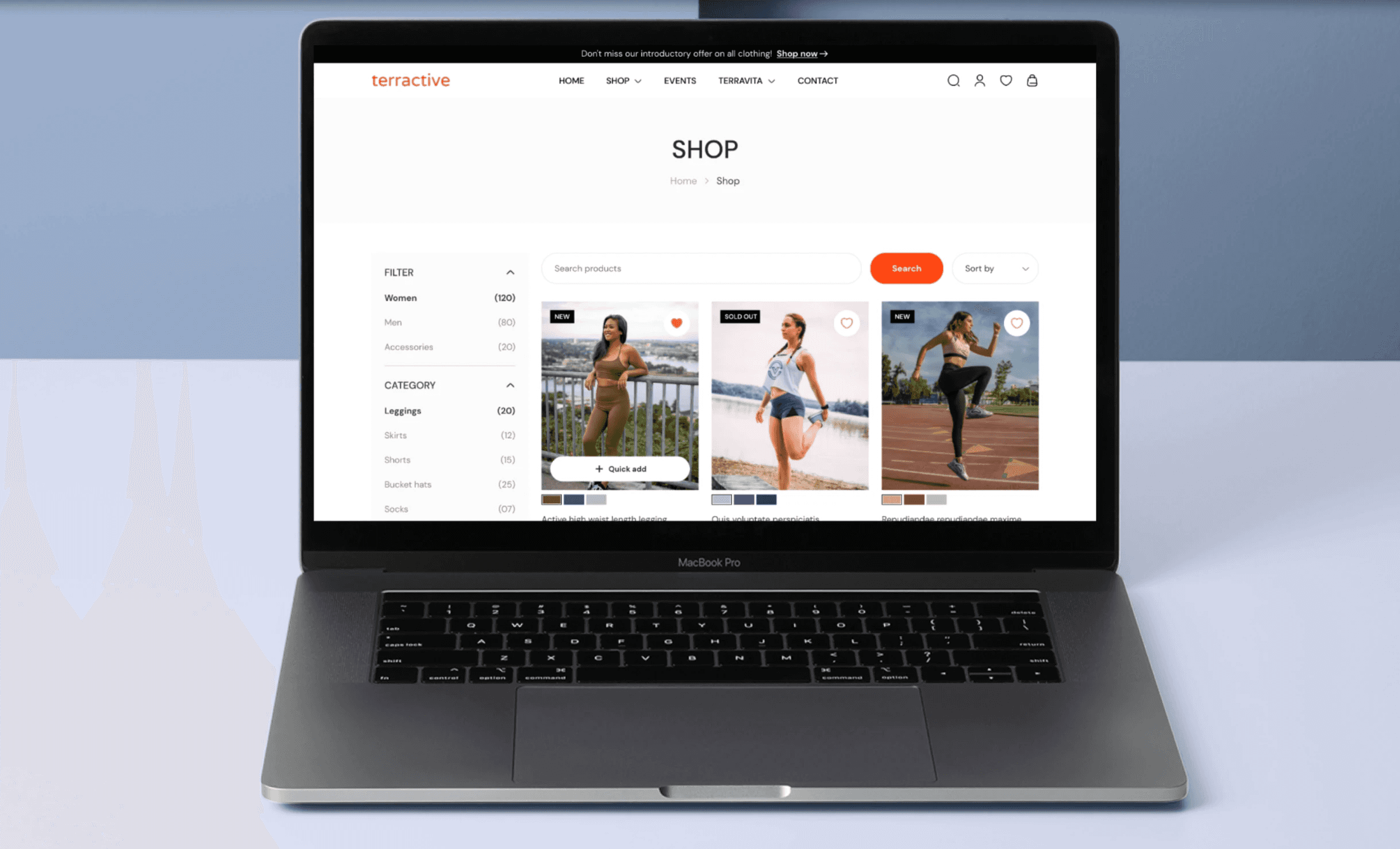
A sleek, modern website design for Terractive, a high-performance activewear brand.
A sleek, modern website design for Terractive, a high-performance activewear brand.
A sleek, modern website design for Terractive, a high-performance activewear brand.
Industry
Industry
E-commerce
E-commerce
E-commerce
Tools
Tools
Adobe XD, Photoshop, Illustator
Adobe XD, Photoshop, Illustator
Adobe XD, Photoshop, Illustator
E-commerce
Team
Team
2 UX Designers | 3 Developers | 1 Project Manager
Front-end Developers, Project Manager,
UI/UX Designers
2 UX Designers | 3 Developers | 1 Project Manager
Timeline
Timeline
1 month
Front-end Developers, Project Manager,
UI/UX Designers
1 month
E-commerce
About
About
About
Terractive makes comfortable, durable activewear for everyday movement. The brand focuses on quality, performance, and simple, functional design.
The primary challenge was creating an intuitive, engaging, and seamless online shopping experience for activewear. The website needed to communicate the brand’s emphasis on performance, comfort, and innovative fabric technology while ensuring easy navigation and a mobile-friendly design.
Mobile Responsiveness: Ensuring that the website adapts seamlessly across devices was a significant challenge, considering the increasing use of mobile devices for e-commerce.
Image Optimisation: Managing large product images without affecting page load times required effective image compression and optimisation techniques.
User Engagement: Ensuring that users felt engaged without overwhelming them with too much information. Balancing clear product visuals and text while maintaining fast navigation.
Problem
Problem
Problem
Terractive’s existing site suffered from:
• A confusing product hierarchy
• High bounce rates on mobile
• Slow load times and poor engagement
• Weak brand translation in the UI
We needed to create a frictionless experience that blended performance, style, and usability, with a clear focus on mobile shoppers.
Process
Process
Process
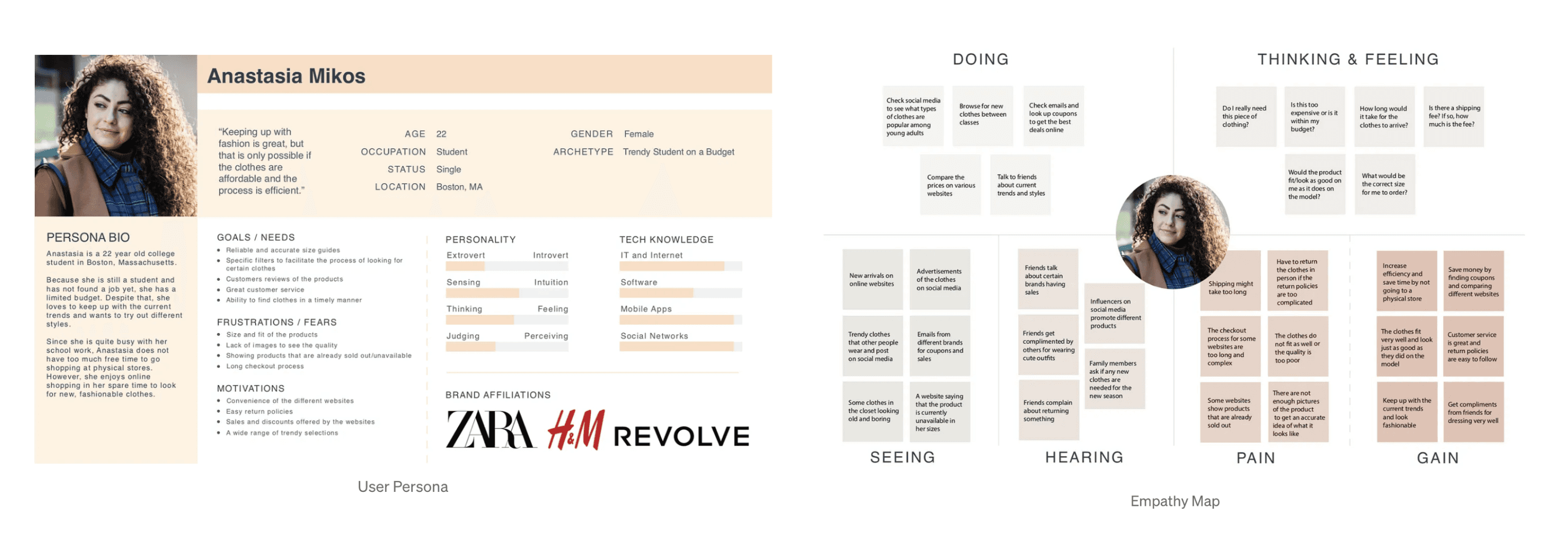
Research & Analysis: We conducted user interviews and analyzed analytics to identify pain points and user needs. We also studied competitor websites and industry trends to gather relevant insights.
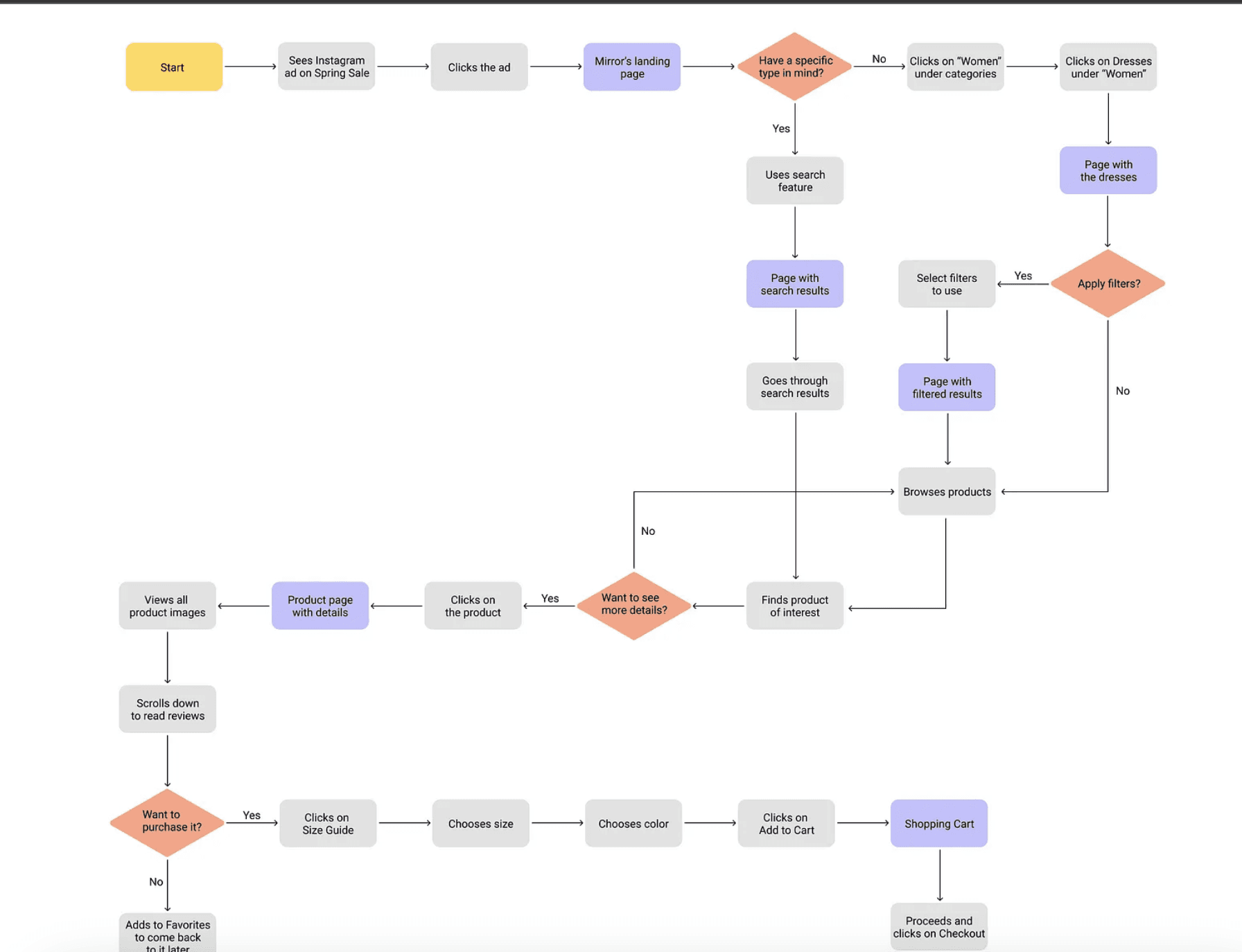
Information Architecture: Based on research findings, we restructured the site’s navigation, prioritizing content and features according to user preferences.
Research & Analysis: We conducted user interviews and analyzed analytics to identify pain points and user needs. We also studied competitor websites and industry trends to gather relevant insights.
Information Architecture: Based on research findings, we restructured the site’s navigation, prioritizing content and features according to user preferences.
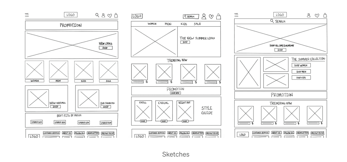
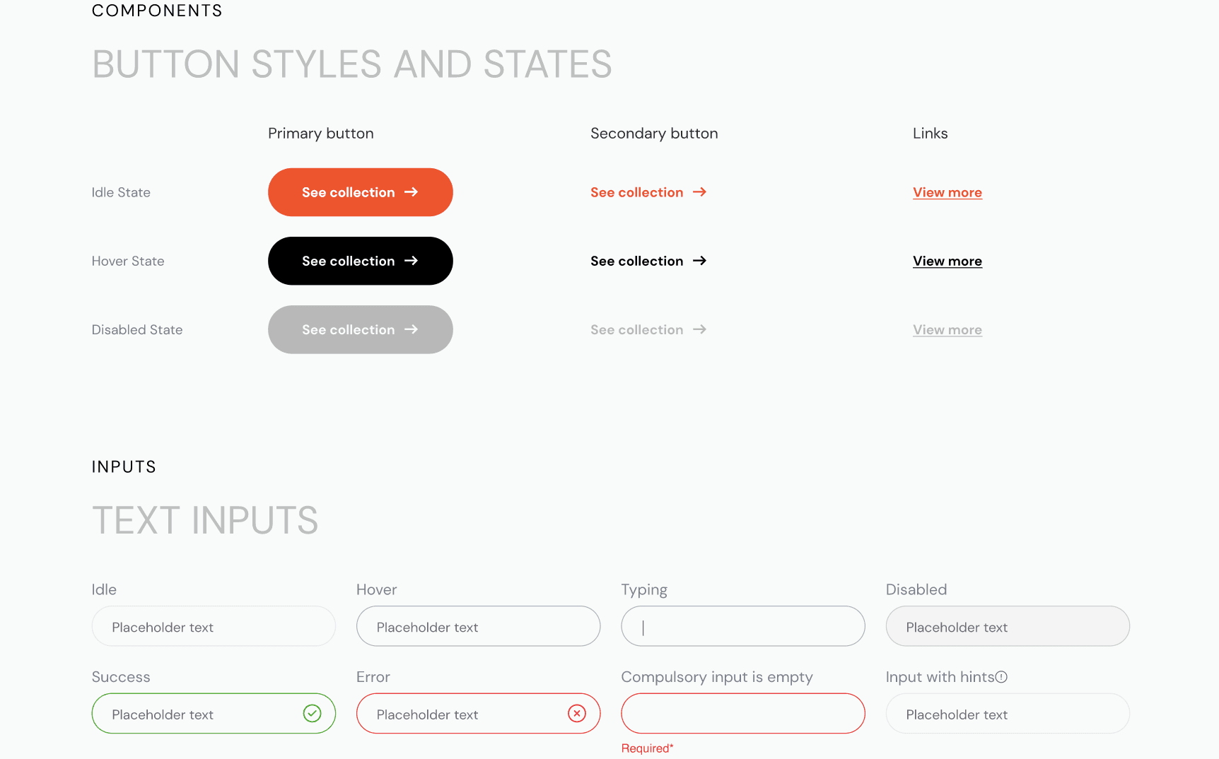
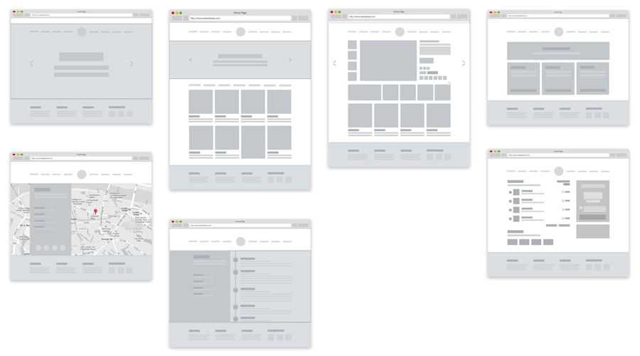
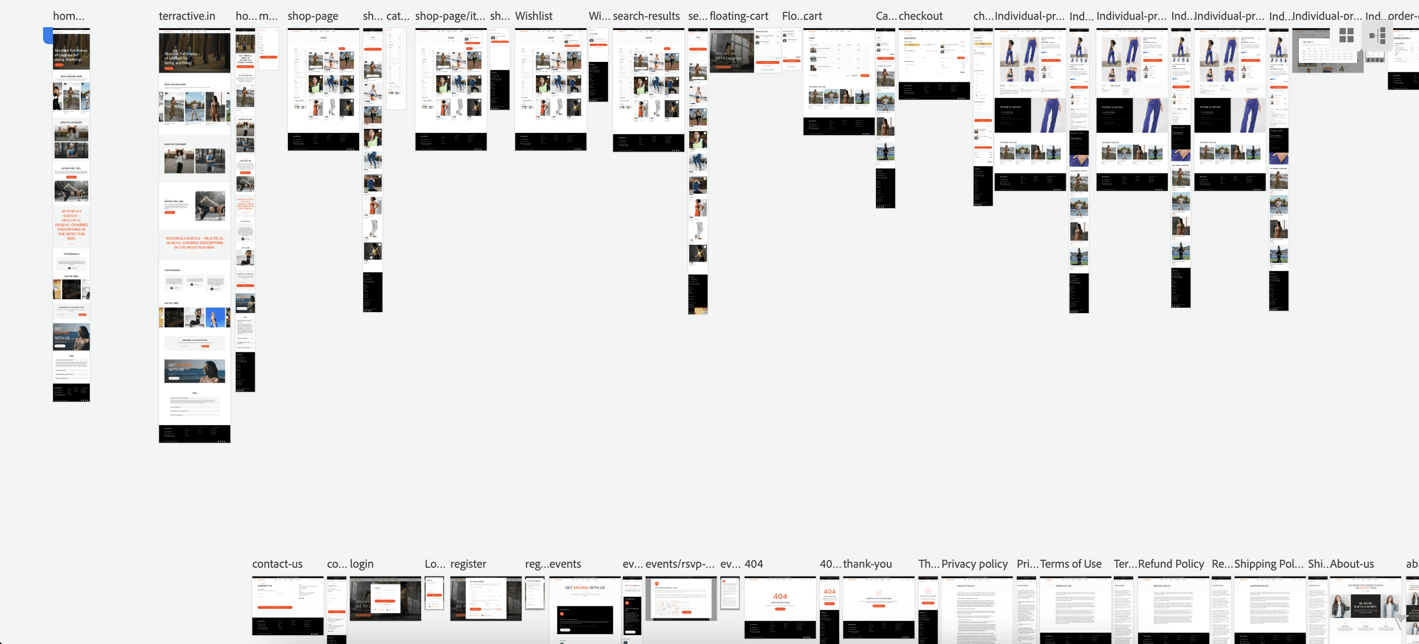
Wireframing & Prototyping: We created low-fidelity wireframes to visualize the new layout, iterating based on feedback. We then built a high-fidelity prototype to test and refine the design.
Usability Testing: Conducted testing with diverse users to validate design choices and make improvements.
Visual Design & Style Guide: Developed a cohesive visual language (color schemes, typography, icons) and a style guide for future consistency in updates.
Wireframing & Prototyping: We created low-fidelity wireframes to visualize the new layout, iterating based on feedback. We then built a high-fidelity prototype to test and refine the design.
Usability Testing: Conducted testing with diverse users to validate design choices and make improvements.
Visual Design & Style Guide: Developed a cohesive visual language (color schemes, typography, icons) and a style guide for future consistency in updates.
Conclusion
Conclusion
Conclusion
The redesigned app features a clean, clutter-free interface, making it easier for users to navigate and access essential features. The improved onboarding process resulted in a 35% increase in new user adoption rates. The addition of personalisation and customisation options enhanced user engagement, leading to a 25% increase in user retention rates.
The redesigned app features a clean, clutter-free interface, making it easier for users to navigate and access essential features. The improved onboarding process resulted in a 35% increase in new user adoption rates. The addition of personalisation and customisation options enhanced user engagement, leading to a 25% increase in user retention rates.