
Payment Flow Redesign
Payment Flow Redesign
Instruct Me is a driving lesson marketplace that connects learners with instructors.
Industry
Industry
Driving Lesson Marketplace
Driving Lesson Marketplace
Tools
Tools
Figma, Photoshop, Illustator
Figma, Photoshop, Illustator
Figma, Photoshop, Illustator
E-commerce
Team
Team
1 UX Designer | 2 Developers | 1 Project Manager
Front-end Developers, Project Manager,
UI/UX Designers
1 UX Designer | 2 Developers | 1 Project Manager
Timeline
Timeline
3-4 days
Front-end Developers, Project Manager,
UI/UX Designers
3-4 days
E-commerce
Link
E-commerce
About
About
About
The platform allows students to easily search for instructors, book lessons and make payments online. The key problem I worked on was improving the payment flow to make it faster, more intuitive and mobile-friendly.
Problem
Problem
Problem
The initial payment flow on the platform was cumbersome, with multiple steps that confused users and increased abandonment rates. Learners found it difficult to follow through with bookings due to unclear pricing, too many pages in the flow, and lack of visual clarity. Additionally, there was no clear indication of whether their payment was successful, which led to frustration and confusion.
Solution
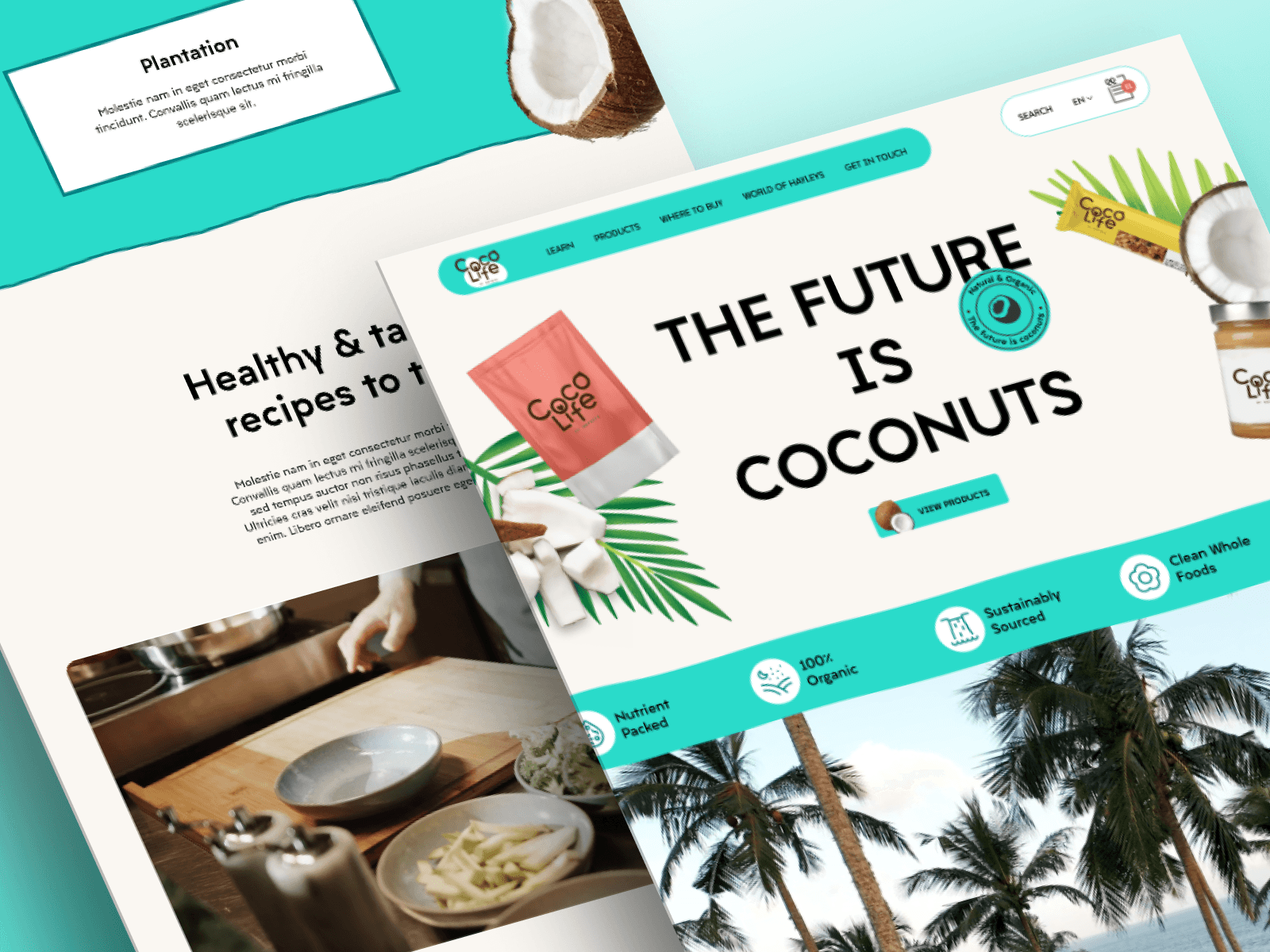
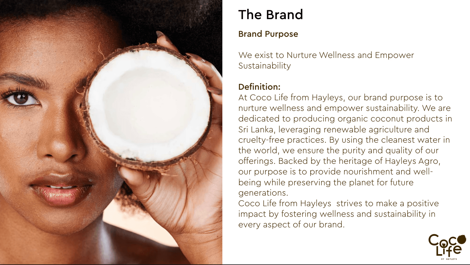
A fully custom website was designed to reflect Coco Life’s brand values of sustainability, purity and heritage.
Solution
Solution
The goal was to create a simplified payment process that reduces friction and guides the user through each step. The solution involved:
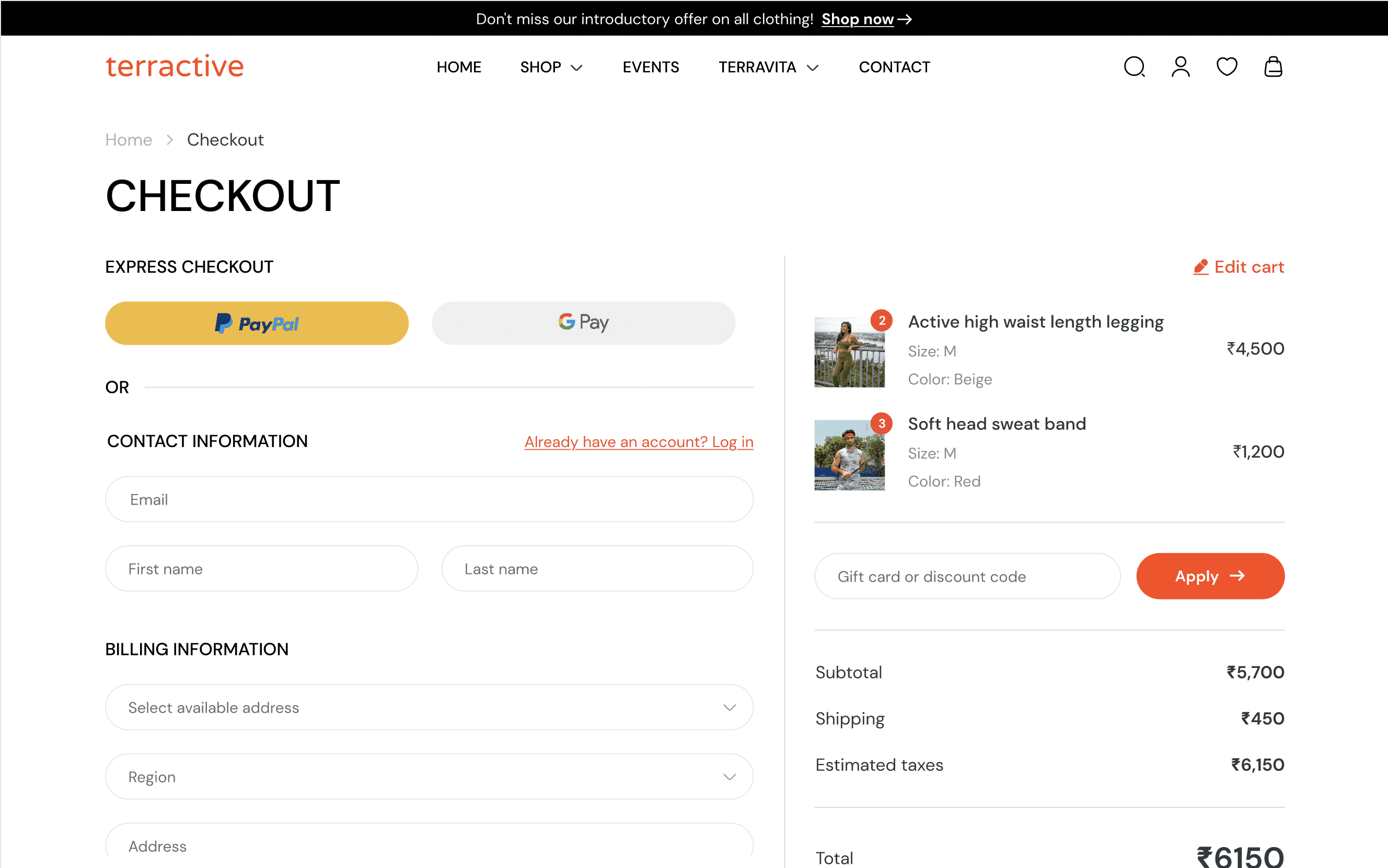
Streamlining the steps for booking and paying.
Simplifying pricing to ensure transparency.
Providing clear confirmation of successful payments.
Responsive design for both mobile and desktop users.
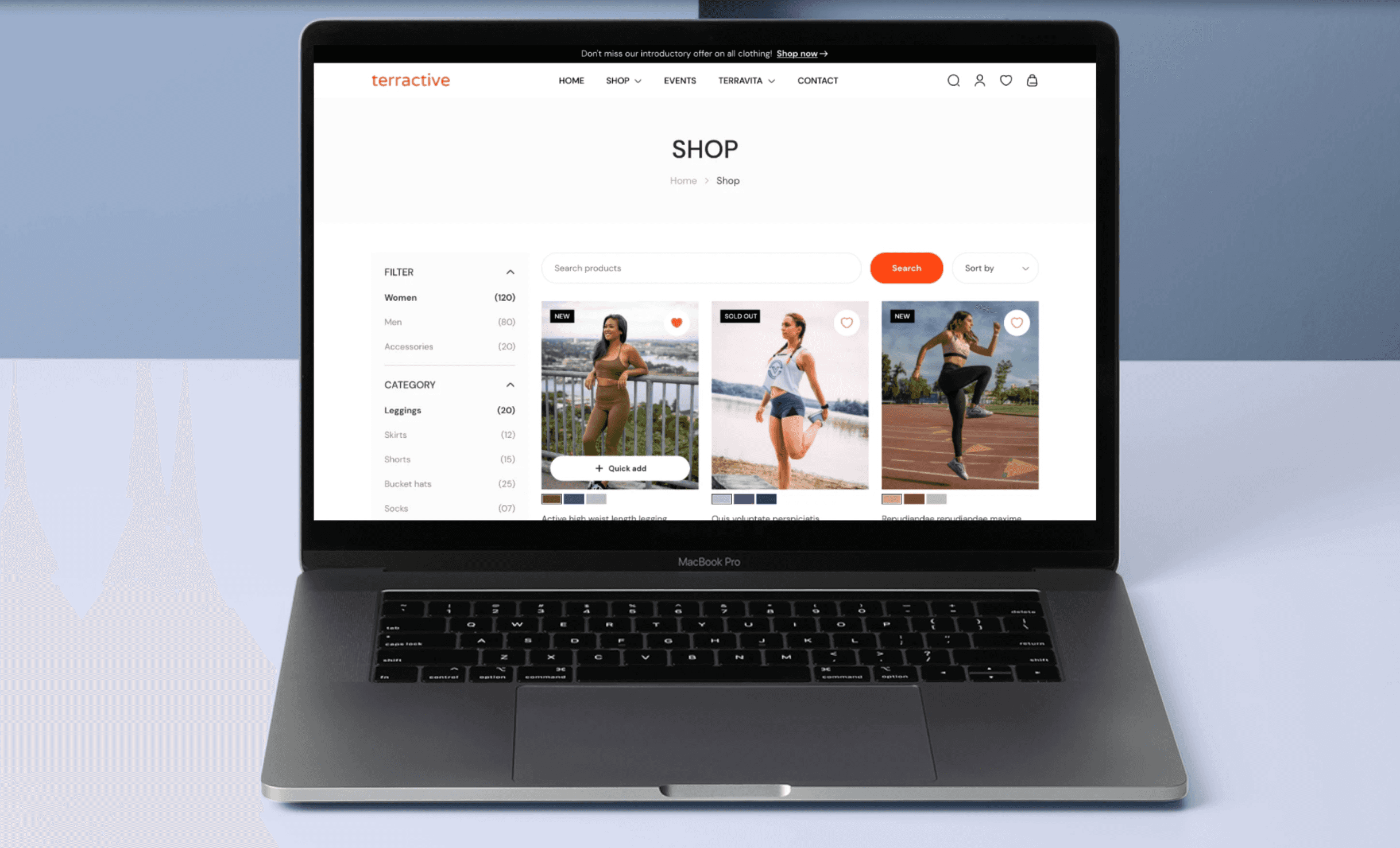
• Brand visual: Align visual design with brand values: comfort, performance, innovation
• Clear and simple layout: The interface was designed to be intuitive and clean, making it easy for users to browse and understand the range of organic coconut products.
• International user focus: The site content and structure were tailored to educate global audiences about the brand while ensuring easy navigation and accessibility for international users.
• Interactive prototype: An interactive prototype was developed to create an engaging and responsive experience, helping users connect more deeply with the brand story and values.
• Drop in bounce rate: Reduce bounce rate and improve product discoverability
• Mobile responsiveness: Improve mobile usability and responsiveness
How I Approached This Design?
How I Approached This Design?
How I Approached This Design?
1.Research
1.Research
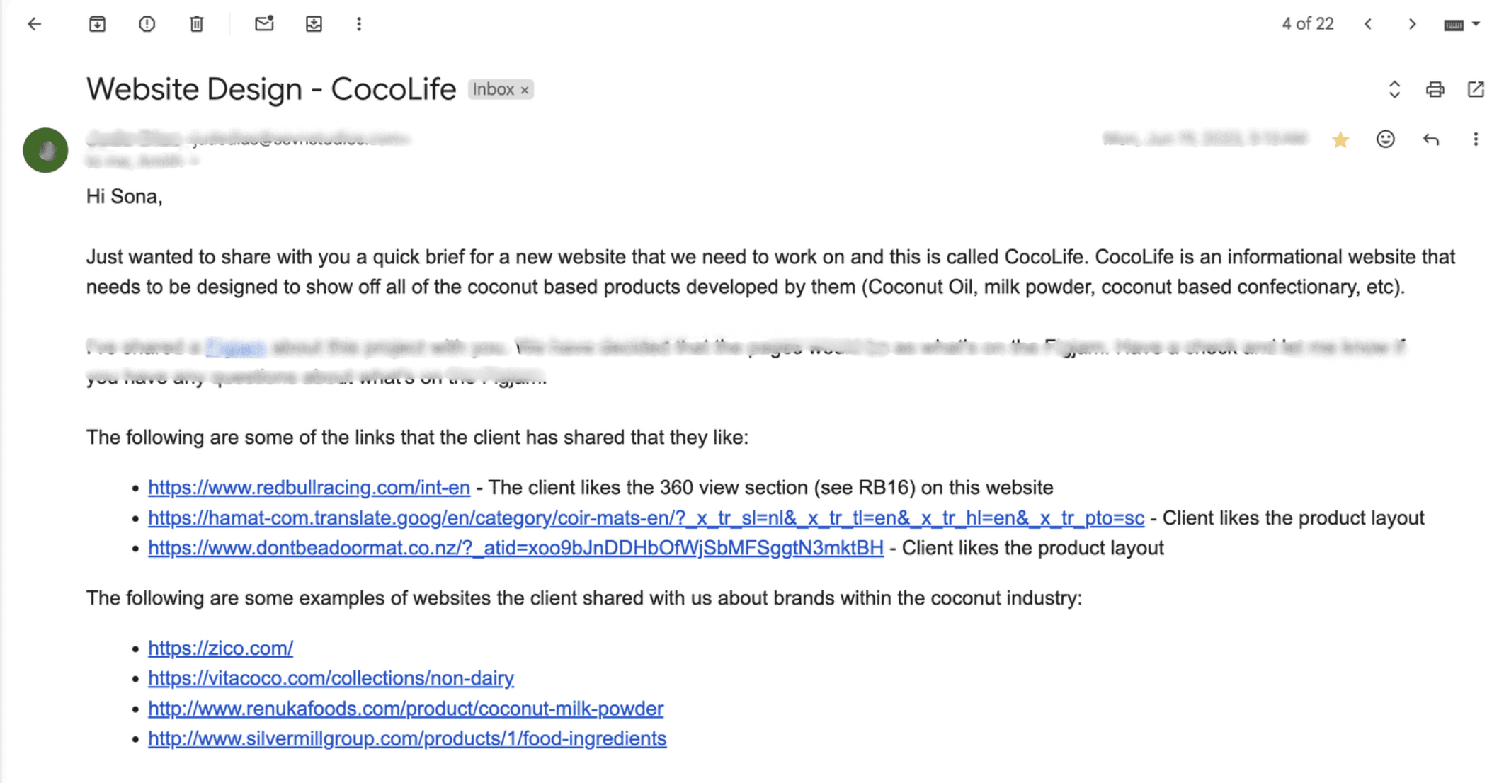
Project brief
Project brief
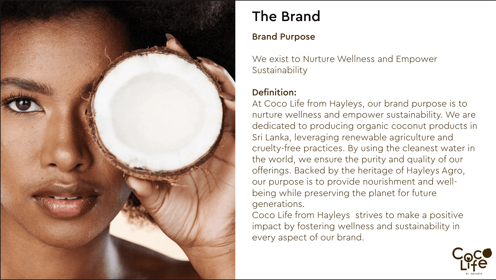
Before diving into design, I worked closely with the team to define what the website needed to achieve. Since Terractive was launching online for the first time, the focus was on building a user-friendly, mobile-first experience that helped people discover, trust and shop with ease.
Before diving into design, I worked closely with the team to define what the website needed to achieve. Since Terractive was launching online for the first time, the focus was on building a user-friendly, mobile-first experience that helped people discover, trust and shop with ease.
Target audience
Target audience
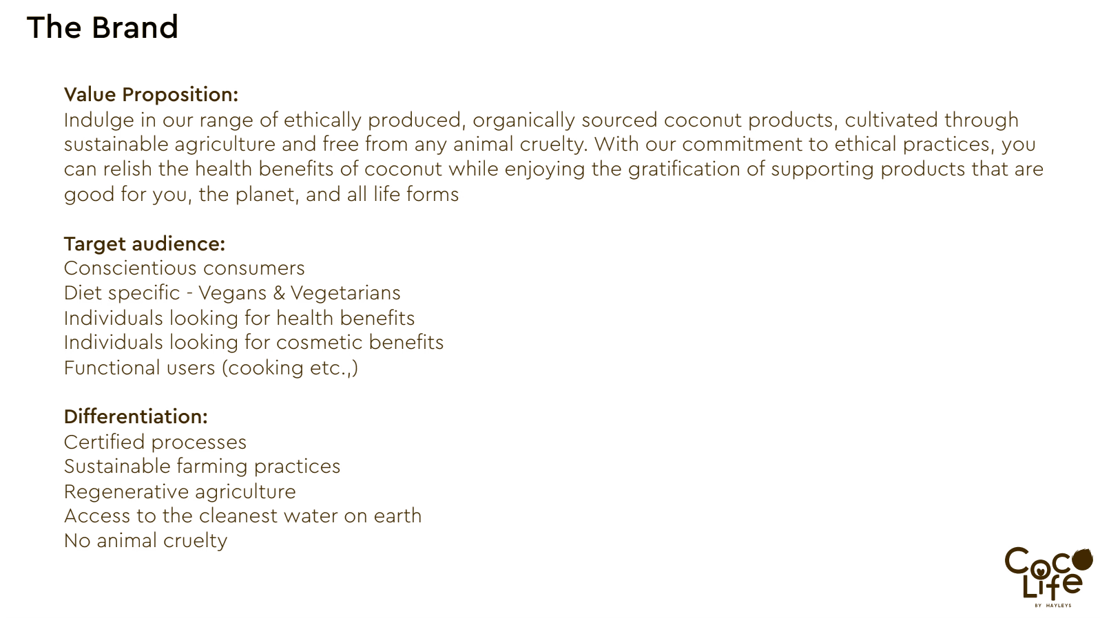
To design with purpose, I needed to understand who we were designing for. I interviewed fitness-focused shoppers between age 22–38 to learn how they browse, what matters to them like sizing info, speed, and trust and how they shop on mobile. Their feedback shaped every decision from content to layout.
To design with purpose, I needed to understand who we were designing for. I interviewed fitness-focused shoppers between age 22–38 to learn how they browse, what matters to them like sizing info, speed, and trust and how they shop on mobile. Their feedback shaped every decision from content to layout.
Creating sitemap
Creating sitemap
Once I had a clear understanding of the users and brand goals, I mapped out the structure of the site. The sitemap was designed to simplify navigation and help users quickly browse by activity, gender, or collection without getting overwhelmed.
Competitor analysis
Competitor analysis
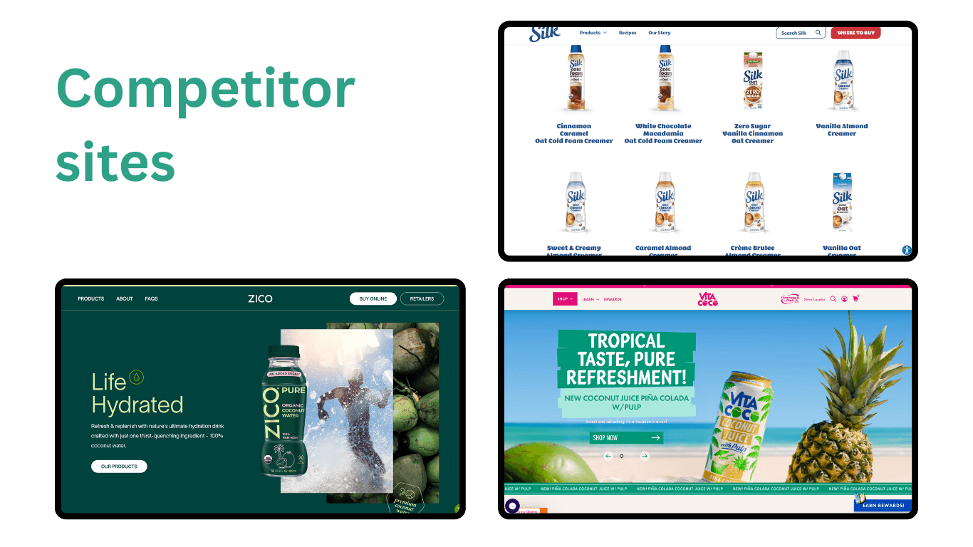
To make sure Terractive stood out, I studied direct competitors like Gymshark, Nike, and Lululemon. I looked at how they handled product filtering, reviews, mobile nav, and visual storytelling. This helped me identify what worked and where Terractive could do better.
2.Sketching
2.Sketching
After thorough research & analysis, I began sketching some versions of the screens.
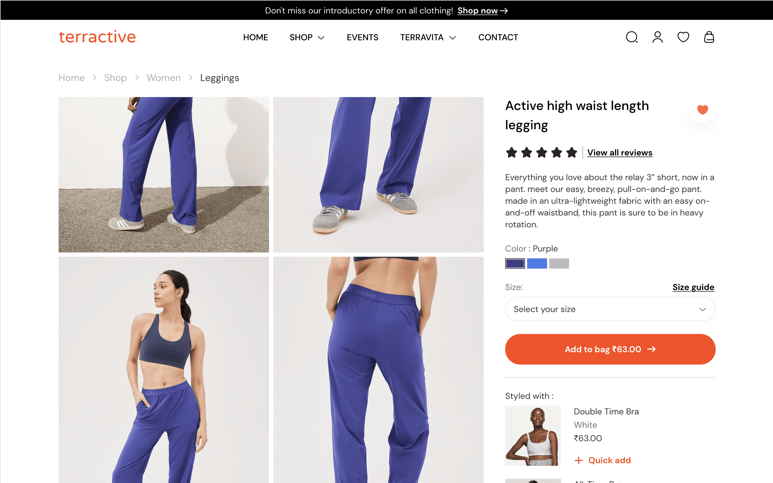
Multiple iterations were done for each component and discussed with the client for feedback. Below is an example of sketches done for individual product page.
After thorough research & analysis, I began sketching some versions of the screens. Multiple iterations were done for each component and discussed with the client for feedback. Below is an example of sketches done for individual product page.
Iteration 1
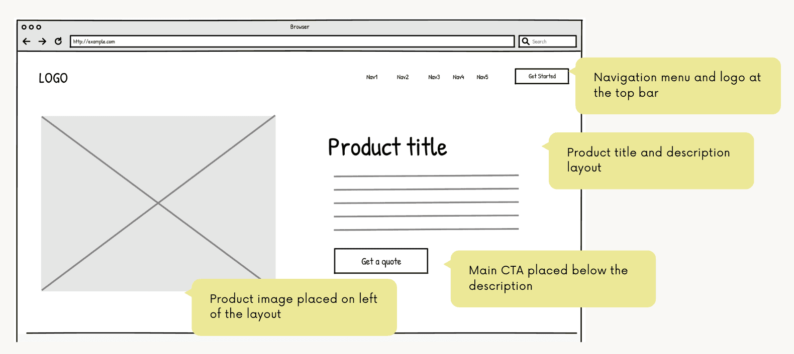
The initial sketch included the logo, product image, navigation placement, product title, short description, and a CTA ("Get a quote").
Iteration 1
The initial sketch included the logo, product image, navigation placement, product title, short description, and a CTA ("Get a quote").
Iteration 2
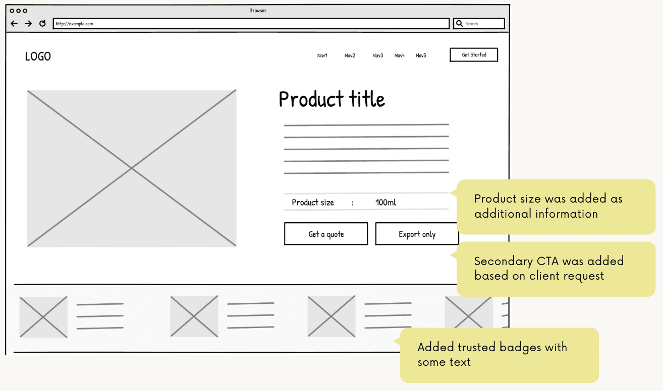
In the next iteration, I cleaned up the layout by grouping CTAs like “Export only” together and adding product size and trust badges more clearly. I focused on improving spacing and visual flow so everything felt more balanced.
Iteration 2
In the next iteration, I cleaned up the layout by grouping CTAs like “Export only” together and adding product size and trust badges more clearly. I focused on improving spacing and visual flow so everything felt more balanced.
Iteration 3
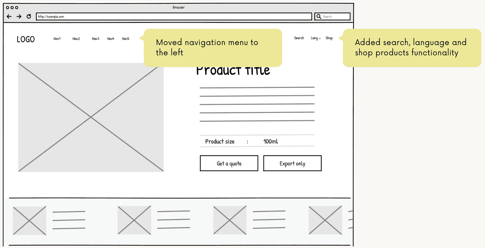
In the final version, I added search, language selection, and shop products features to make the experience more user-friendly. The navigation menu was moved to the left to better organize multiple items and keep things clean as the site expanded.
Iteration 3
In the final version, I added search, language selection, and shop products features to make the experience more user-friendly. The navigation menu was moved to the left to better organize multiple items and keep things clean as the site expanded.
3.Wireframing
3.Wireframing
Wireframes were made to plan page layout and structure. Main components like images, text, and buttons were placed to keep UI clear. Iterations were done based on what users need and what worked better.
Wireframes were made to plan page layout and structure. Main components like images, text, and buttons were placed to keep UI clear. Iterations were done based on what users need and what worked better.
4.Testing and feedback
4.Testing and feedback
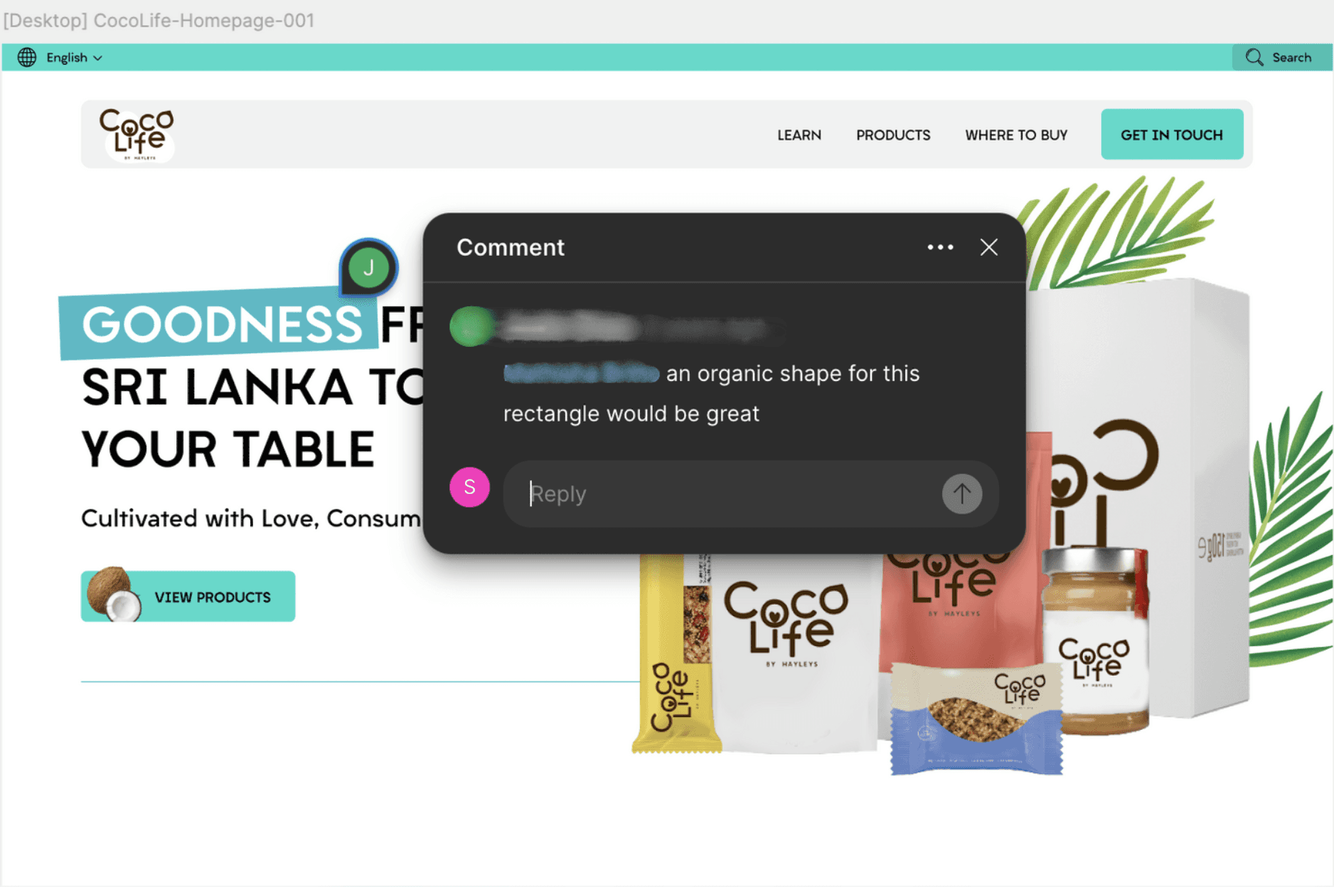
• Small changes were made based on feedback, such as adjusting layout spacing and button placement to improve clarity and flow.
• Cross-browser and QA testing were conducted to ensure compatibility across different browsers.
• Small changes were made based on feedback, such as adjusting layout spacing and button placement to improve clarity and flow.
• Cross-browser and QA testing were conducted to ensure compatibility across different browsers.
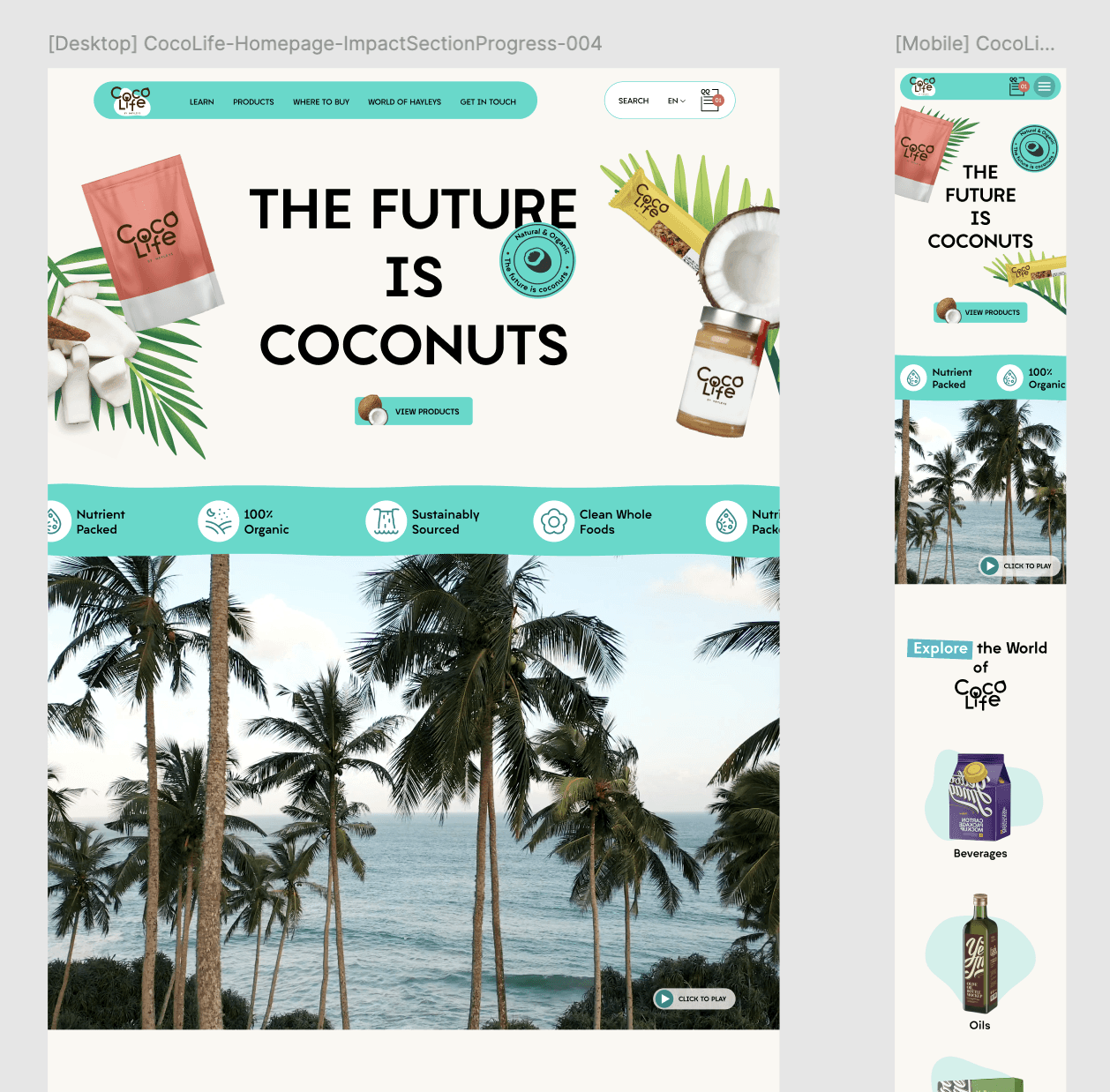
• Mobile optimisation was thoroughly checked.
• Mobile optimisation was thoroughly checked.
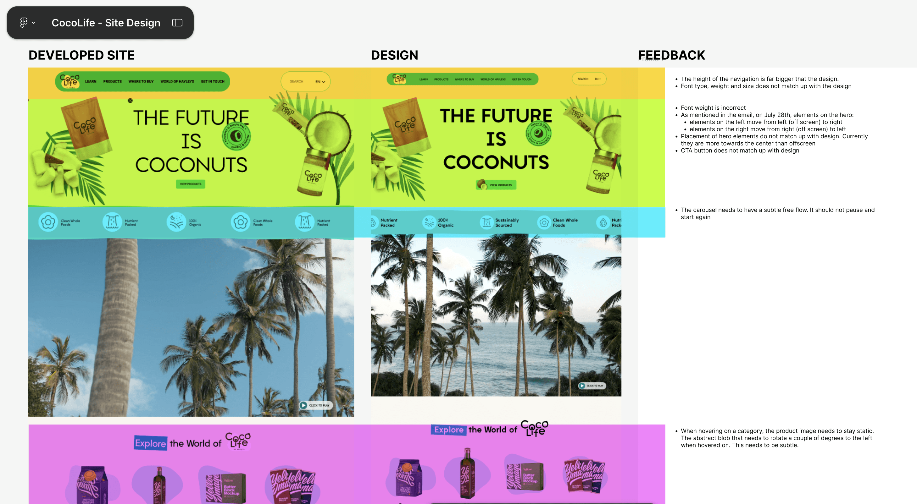
• The developed site was reviewed alongside the design to ensure consistency and accuracy in the final product.
• The developed site was reviewed alongside the design to ensure consistency and accuracy in the final product.
30% 25% 30%
User drop-off reduction Faster purchase flow More page views
30% 25% 30%
User drop-off reduction Faster purchase flow More page views
Reflection and Take Away
Reflection and Take Away
Reflection and Take Away
30%
User drop-off reduction
25%
Faster purchase flow
30%
More page views
Working on the Coco Life website was a really rewarding experience. Since the brand didn’t have any online presence or even a clear visual identity, I had the chance to shape how they would be seen digitally from the ground up. That meant not just designing a website, but also building a sense of branding that felt true to who they are: clean, organic and ethical.
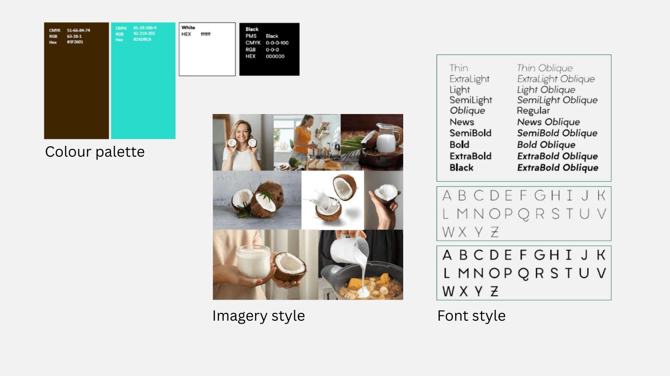
To create a brand identity that felt natural and trustworthy, I focused on:
• Color palette: Soft, earthy tones inspired by coconuts and nature
• Typography: Clean and minimal fonts to reflect purity and simplicity
• Visual elements: Lots of white space, product-focused imagery and subtle textures
These elements helped build a consistent, meaningful look and feel across the site even without a formal brand guide in place. While I documented all my research and design decisions for the client, I’ve realised how useful a more structured, future-proof design system would’ve been. A proper design system could have made the design more scalable for future teams. Still, the experience taught me a lot about branding from scratch and how design choices can shape how people connect with a product online.
Working on the Coco Life website was a really rewarding experience. Since the brand didn’t have any online presence or even a clear visual identity, I had the chance to shape how they would be seen digitally from the ground up. That meant not just designing a website, but also building a sense of branding that felt true to who they are: clean, organic and ethical.
To create a brand identity that felt natural and trustworthy, I focused on:
• Color palette: Soft, earthy tones inspired by coconuts and nature
• Typography: Clean and minimal fonts to reflect purity and simplicity
• Visual elements: Lots of white space, product-focused imagery and subtle textures
These elements helped build a consistent, meaningful look and feel across the site even without a formal brand guide in place. While I documented all my research and design decisions for the client, I’ve realised how useful a more structured, future-proof design system would’ve been. A proper design system could have made the design more scalable for future teams. Still, the experience taught me a lot about branding from scratch and how design choices can shape how people connect with a product online.